In the previous two posts in this series, I came up with a method of scoring the sentiment of tweets from the Q&A program. I now want to put all these pieces together to try and get a feel for the political leanings of Twitter users watching the program.
The big problem with this analysis, as I said in the last two posts, is that most tweets are negative, so even the positive tweets are comprised of words with negative sentiment.
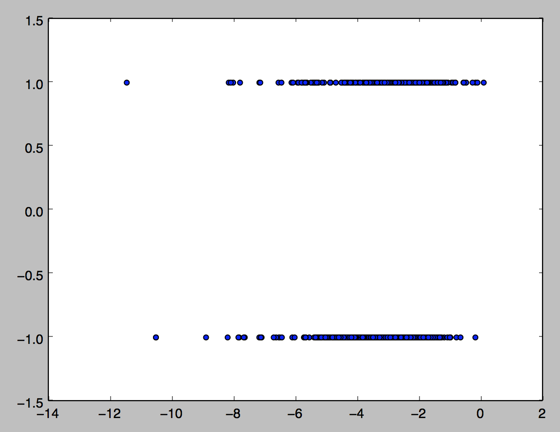
This diagram shows the real problem; of the 764 tweets I hand-classified as positive or negative, using the basic calculation from the previous post, it’s very difficult to separate them by their sentiment score alone. However, if we include two variables, namely
NormalisedSentiment: sum of all sentiments for words in the corpus in the tweet, divided by the total number of words in the tweet
def NormalisedSentiment(tweet):
    score = 0
    for word in tweet.split(' '):
        try:
            score = score + sentiment_dict['rating'][word]
        except KeyError:
            pass
    return score
NegativePercentage: number of words with a sentiment less than zero, divided by the total number of words in the tweet
def NegativePercentage(tweet):
    total_words = 0
    bad_words = 0
    for word in tweet.split(' '):
        try:
            if sentiment_dict['rating'][word] < 0:
                total_words += 1
                bad_words +=1
            else:
                total_words += 1
        except KeyError:
            pass
    return float(bad_words) / float(total_words)
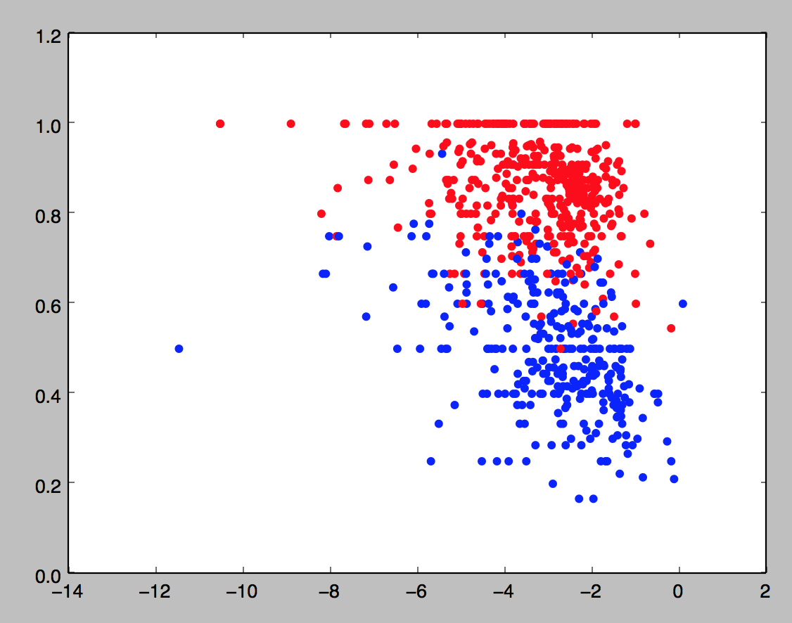
If we do a scatter plot of these two variables and color by classification (blue is positive, red is negative),
training_data = pd.DataFrame([tweets_final, normsent, negperc, classes]).transpose()
training_data.columns = ['tweet', 'normsent', 'negperc', 'class']

X = training_data[['normsent', 'negperc']].values
y = training_data['class']

color_map = []
for score in classes:
    if score == 1:
        color_map.append('b')
    else:
        color_map.append('r')
plt.scatter(training_data.normsent, training_data.negperc, c =color_map)
plt.show()
we get the following picture:
I now want to use simple support vector machines (which is just linear regression in this easy case) to train a decision boundary on this training data. Scikit-learn makes this particularly straightforward (I found a function plot_surface to plot the decision boundary as I had a bit of trouble figuring it out myself; I’m not quite sure why it comes out as a squiggle, but it gets the point across nevertheless):
est = svm.SVC(kernel = 'linear')
linear_model = est.fit(X,y)
ax = plt.gca()
ax.scatter(training_data.normsent, training_data.negperc, c =color_map)
plot_surface(est, X[:,0], X[:,1],ax =ax)
plt.show()
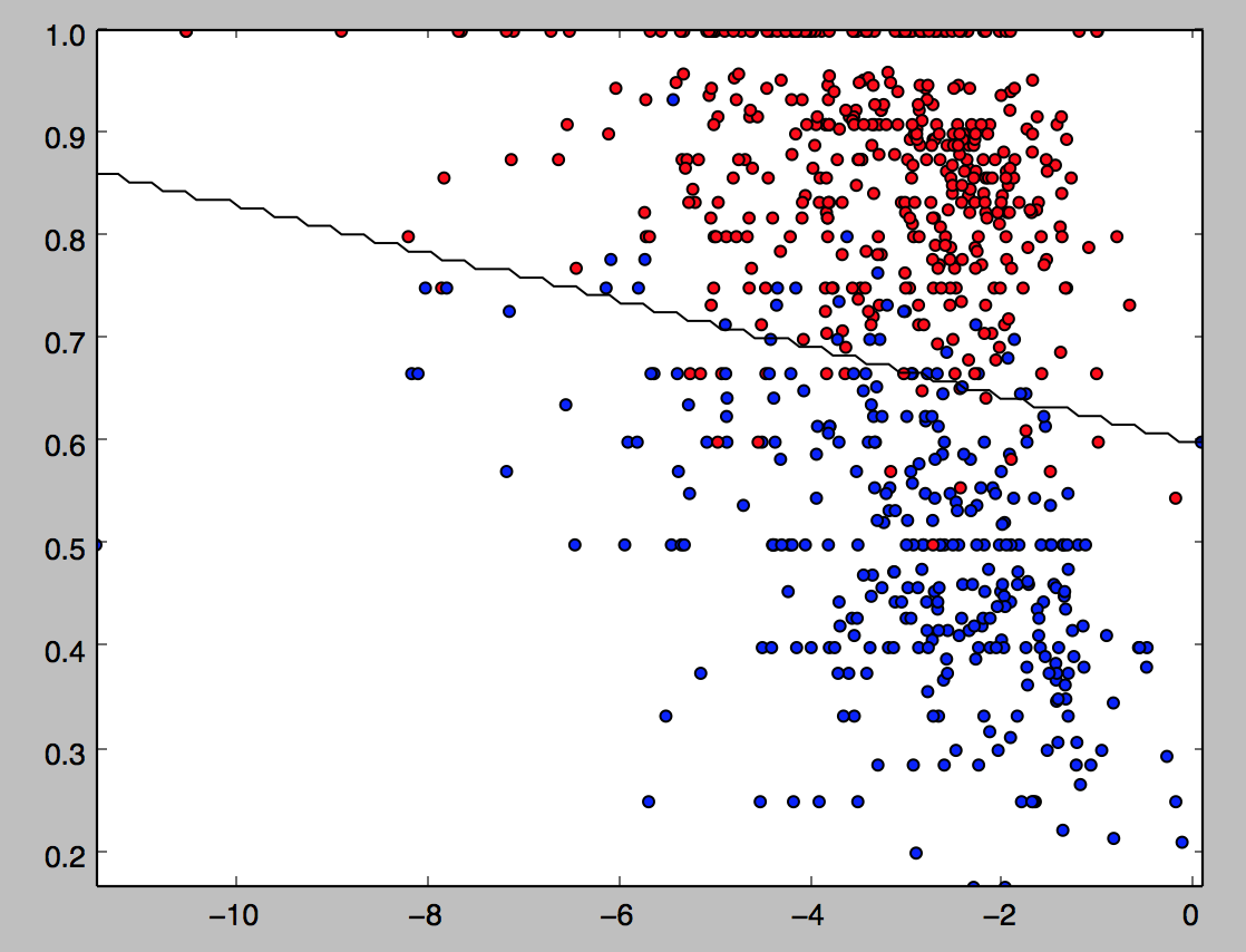
We then fit this model to the much larger training set (noting again the model, which currently has about 72% accuracy, will only get better the more tweets I classify):
Let’s see how this classification does with a few examples before we finish up by adding in the basic entity recognition:
My smelly fat butternut has decided to watch #qanda with me
    | negative
settling in for another entertaining #qanda
    | positive
Just saw the @QandA panel. Time to go to bed. Night.
    | positive
I can hear it now on #qanda #theirabc tonight.  Free speech hypocrites  #pmlive
    | negative
Thank you @tanya_plibersek for supporting a binding vote. Human rights are not optional. #ItsTimeToBind #qanda
    | negative
@QandA #QandA @tanya_plibersek for PM
    | positive
Dare I watch #qanda tonight after the disappointing censorship of TPP related questions last week?
    | negative
turning on the hate faucet for another week #qanda
    | negative
ah. finally can live tweet @QandA. wish I had something worthy to say.
    | positive
This model seems like it’s doing a fairly decent (but obviously imperfect) job of classifying these tweets.
So using a list of right-wing associated words like
Coalition,coalition,Liberal,liberal,libs,Libs,Abbott,abbott,abbot,Abbot,Abott,abott,Howard,howard,Robb,robb,Andrew,andrew,Menzies,menzies,pm,PM,prime minister,Prime Minister,Tony,tony,Arthur,arthur,Sinodinos,sinodinos,tim,Tim,fischer,Fischer
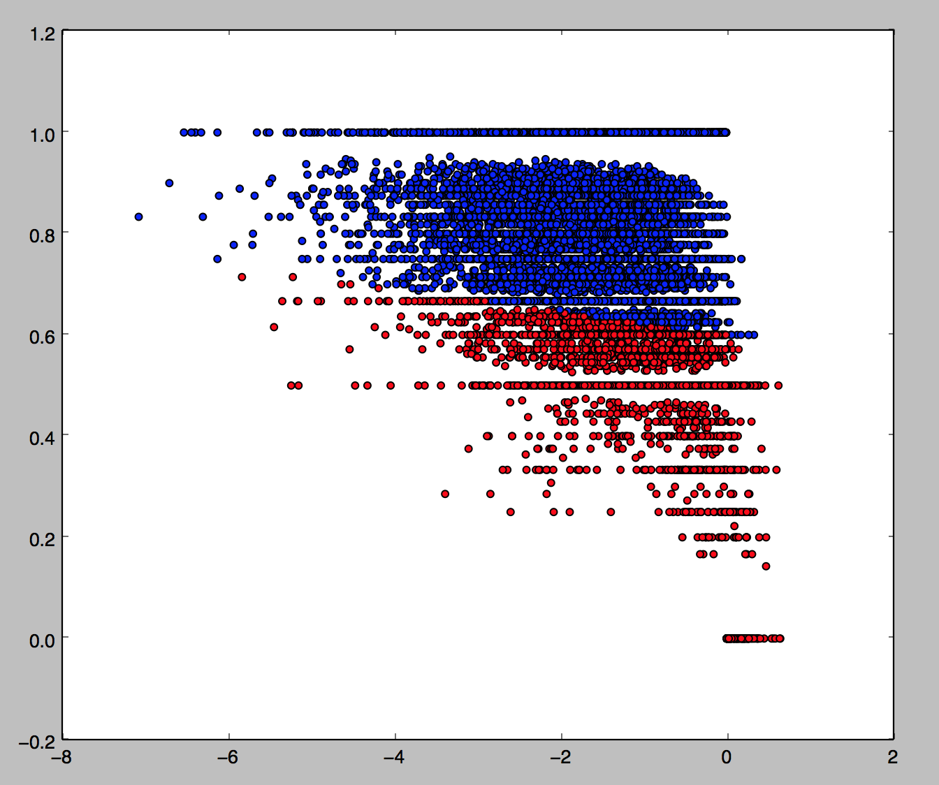
and a similar list for left-words, we can color the tweets again according to whether they are left-aligned (negative with a right entity or positive with a left entity) which are red, right-aligned (vice versa) which are blue, or neither, which are white.

Left tweets: 6.57%
Right tweets: 4.01%
Total tweets: 10766
[Finished in 49.1s]
This gives 62% of tweets where an entity can be identified as left-wing, and 38% as right-wing (and fits in very well with the ABC’s 39/39/22 ALP/COA/GRN split in the studio audience). This seems fairly believable to me (note however that only 11% of tweets have an entity identified, hence all the white in the picture). Note it doesn’t look like there’s much of a relationship between right-left and positive-negative.
I will remark finally that, although this model isn’t great, it can easily be improved through the “unreasonable effectiveness of data”: all this needs to get much better is more human classification of tweets, and a better input file for entity recognition.